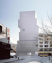
 The experience of the gallery and workshop project provided several learning experiences. The most interesting experience was the process of theorising and design. I spent a lot of time trying to analyse precedent buildings and drawings. I tried to influence the building strongly with these ideas and inspirations. The most difficult part of this project was the model, which took days of confusion and patience due to the different levels in the design. I learnt from the presentation that I had overlooked the inclusion of the pedestrian path which was crucial to the design. This oversight was a learning point and will help me to remember to include higher site detail in the next design. The architect juror also gave me some different approaches to design in terms of the public/private aspect of the gallery. Above is a precedent building by Atelier Bow Wow which inspired me to make my building stand out in the streetscape.
Sunday, June 13, 2010
Summary of the gallery project
The experience of the gallery and workshop project provided several learning experiences. The most interesting experience was the process of theorising and design. I spent a lot of time trying to analyse precedent buildings and drawings. I tried to influence the building strongly with these ideas and inspirations. The most difficult part of this project was the model, which took days of confusion and patience due to the different levels in the design. I learnt from the presentation that I had overlooked the inclusion of the pedestrian path which was crucial to the design. This oversight was a learning point and will help me to remember to include higher site detail in the next design. The architect juror also gave me some different approaches to design in terms of the public/private aspect of the gallery. Above is a precedent building by Atelier Bow Wow which inspired me to make my building stand out in the streetscape.
Final presentation - gallery model 1:100
 The image above is an aerial view of the site which shows the glass street facade, the three large skylights, the back courtyard and the workshop. This view shows the building's relationship to the neighbouring buildings as well.
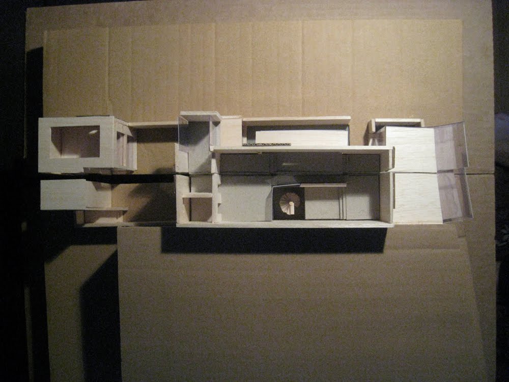 This view shows the key feature of the stairwell. It also shows the key spaces of the apartment, the courtyard, the workshop and the main gallery. The circulation through the apartment is clear in this image - moving from the stairs, through the public rooms and then towards the private areas.
This view shows the street view of the building. It was intentionally designed to stand out from the neighbouring buildings in terms of height, colour and texture. A path runs between the gallery site and the bakery/deli building.
 The image above shows the East elevation of the gallery without the obstruction of the bakery/deli building. This shows the view that the passing pedestrians would see of the gallery - with places to pause and look into the gallery and the workshop. The cantilevered rooms with their views of King St and the park also stand out from this vantage point.
 Here is the opened section model which draws attention to the length and the linear emphasis of the project. Sited in such a long, narrow site, the building stretches lengthways rather than upwards. In this image, the sequences of spaces is visible, showing the importance of circulation in this project.
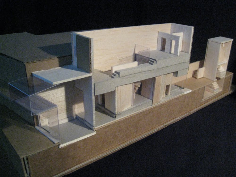 This West side of the building shows the main gallery built lower into the ground, with the multi-levelled gallery experience as well as the ascending circulation of the apartment above.
 This East view of the site shows again the mixture of levels in the gallery and the apartment. The levels in the gallery rely on a system of exposure and immersion into the art, whereas the apartment levels are designed for a feeling of academic transcension.
Friday, June 11, 2010
Final presentation - information
I have included the new background text from the below poster to assist in understanding the site information which I gathered:

The site for this gallery is between a Dendy cinema complex and a deli and bakery. The Cinema includes a cafe and music shop. This cultural building is a good location for an art gallery due to the crossover traffic that it would generate. The other approach from the right hand side reveals a bakery and a deli as the immediate neighbours. These businesses cater to specialty customers who prefer good quality goods. The skyline is flat on either side of the building which is different to the majority of buildings in Newtown. It allows for the gallery design to either blend in or stand out.

 This poster was designed previously and has been explained in the post: 'Project 3 ideas for the art and the gallery'.
 The presentation below shows some of the images included in the gallery drawings. The text is as follows: The Images here were included in the sections and vignettes of the gallery. Murakami Takashi is inspired by anime and manga, advertising and consumer goods. He questions high and takes inspiration from low art. Murakami advocates a deep exploration into anime and harmless cute images. Yoshimoto Nara is another Japanese pop artist. His influences include high art, illustration, and graffiti. His work often deals with childhood themes of boredom, frustration and seeming innocence.
Final presentation drawings
 The first set of drawings for the final presentation was a series of elevations showing the exteriors of the gallery and workshop. The final presentation drawings were at scale 1:100 and were printed on A2 paper. The elevations included varied line widths and shadows to show depth.
The plan drawings were more detailed than my past drawings, with a higher level of inhabitation than previous projects, which was realised through the inclusion of more furniture and artworks. The precedent for these drawings was the plans and sections by the Japanese architecture firm, SANAA.

The section drawing and vignettes include a similar level of detail to the plans. The section included a printing press in the workshop, which is a key theme for the project, representing low art and repetition.
 The poches of the plan drawings had to be scanned in B&W due to their size and the lack of A2 color scanning facilities at the printshop. However, the sense of light and atmosphere is still captured to an extent. The drawings show that the two main gallery areas and the focal stairwell are major sources of light.
The poche plan and section of a room (the main gallery) demonstrates the filtering of light through the glass shopfront and glass floor above the awning. The section poche shows the major lit spaces of the front gallery, the upstairs apartment and the stairwell. The light in the downstairs gallery core is mostly artificial, with a low level of diffused natural light near the floor, where the water outside reflects the light upwards.
The vignettes below attempted to capture particular interior spaces. This first vignette is taken from the workshop and reiterates the key idea of the printmaking editioning process and its connection to Superflat ideas of low art and mass media.
 The vignette below is of the gallery owner's private gallery on the large landing leading into her apartment. The close proximity of the artworks due to the size of the space allows the viewer to interact closely with the works when entering or leaving the apartment.
This vignette emphasizes the ascension from the spacious, cantilevered kitchen into the raised tatami room, which is represented in black to emphasise the space. The tatami room, which is used for study and for quiet entertaining, is the final upward space in the process of travelling through the apartment length to the private spaces.
 The main gallery entrance in this vignette shows the visual connection between the largest gallery and the print shop which provides the gallery's income. This openness is important because of it direct link with the works and the locally editioned 'sister works' made by the artists.
The vignette below shows the small prints room as seen from the second gallery. The small prints room is designed on a smaller scale in order to facilitate a closer viewing of the smaller works.

Friday, June 4, 2010
draft model for week 13
The process of making the second draft model helped me to understand design issues. I made this model to check the circulation and ascension through the upper rooms and it helped to be able to see it. Some of the spaces that cantilevered outward were overlooked during construction, which I should remember when making the final model.
 From the side it is clear that this is a draft model - the floor supports are visible. But without the model I would not have understood the problem with one of the upstairs room dimensions.

 From the side it is clear that this is a draft model - the floor supports are visible. But without the model I would not have understood the problem with one of the upstairs room dimensions.
draft drawings for week 13
The images below were completed between weeks 12-13 and are cropped because of the size of the scanner. During the week I worked on various elevations for the gallery and the workshop. Below is the front facade of the gallery.
 I drafted a section as well. I tried to use different pencil line weights but will use ink for the final presentation. The section shows the different levels of the building.
 The three floor plans could not be completely scanned. Here are some parts of different plans that give an idea of the effects of the inking medium over previous pencil drawings.
 I attempted some vignettes and decided that ruled images were unsuccessful. I prepared some on good tracing paper, some pencil sketches and the below butter paper examples.
 This is a draft section poche. Again, I am going to experiment with different types of paper.
Saturday, May 29, 2010
Draft model for the gallery
The rough draft model displayed was a section of the building and did not show the width of the main path through the building. Next time, I will try to cut the section at a different point. The model still shows some of the movement through the building.
 The model helped to visualise the main entrance and gallery and also problems with the facade.
 This view is from the back entrance into the gallery.

 The model helped to visualise the main entrance and gallery and also problems with the facade.
 This view is from the back entrance into the gallery.
Subscribe to:
Posts (Atom)

